Calls to action (CTAs) are the most essential part of your marketing campaign. It’s also the difference between losing a potential customer and making a sale. A page with a strong CTA button will generate more conversions than a page with a weak one. It’s just that simple.
Do you want to learn how to create the perfect call to action to get customers to do what you want them to? Well, then buckle up because we have six creative call-to-action ideas that are sure to evoke a response.
First, What is a Call to Action?
A call to action (CTA) is a word, phrase, or sentence that prompts the reader to take a specific action. It is the bridge between the content your visitor is already interested in and an offer of higher value. CTAs are usually placed in the form of a button in a prominent spot on your webpage, like our offer that never expires to take you to coffee:

With the right calls to action, you can persuade people who visit your site or read your content to do something specific, such as:
- Buy a product
- Sign up for a newsletter
- Grab a download
- Share a piece of content on social media
- Read the rest of an article
- …and more!
But it’s important to remember that not all calls to action are created equal. Some are strong, powerful, and persuasive while others are weak, boring, and uninviting.
6 Creative Calls to Action That Evoke a Response
There are a number of things that can be optimized, from your headline text, hero images, and videos. The list goes on and on. But no matter what you change, at the end of the day there’s one thing standing between a user and conversion: your call-to-action.
Nerd Fitness: Their CTA is simple and straight to the point with “I’m In!” It’s action oriented and an easy way to get people excited about signing up. And, what’s clever about this banner is that it frames joining their newsletter as a way of “unlocking” a number of different resources.

Problogger: Rather than stating “Get Your Blog Post Prompts”, they rephrased it to say “Get My Blog Post Prompts.” This subtle change can help increase the perceived ownership of the gated content by simply changing “Your” with “My”, ya see that?

Backlinko: As a basic rule of conversion rate optimization, your CTA should always have a significant amount of contrast between itself and everything around it. Check out how they use red, a color not seen anywhere else on the page as the CTA. Because of this, the CTA stands out boldly and commands a user’s attention.

Ancestry: By changing the CTA to “Save Now” in order to correspond with the special promotion Ancestry was running at the time, they were able to reinforce the discount that the page was offering, and in turn potentially increase the total number of conversions.

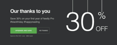
Feedly: One of the most unique things about this CTA from Feedly is that they combine the action of upgrading with the benefit of saving. Boom! By combining the two, they’re able to double the incentive for users to convert, while also keeping the CTA hyperrelevant to the pages offer.

MailChimp: By using a very ambiguous headline combined with very artistic imagery to express elements of their brand, the CTA is clear and to the point. By choosing “Sign up Free”, they are able to combat any objections users might have about price or commitment.

Get Response from Your Calls to Action with Charley Grey
Of course, there are many other factors that go into creating a high-converting landing page. In that sense, CTA buttons are just one ingredient among several.
At Charley Grey, we take care of everything for the life of your website. And by everything, we mean the hosting, security, research, design, development, on-page SEO, backups, maintenance, and CALLS TO ACTION.
Let us take you to coffee and get started!


